| Author |
Topic: Speedy West Low Buck Homage Guitar |
Mike McBride
From:
Indiana
|
 Posted 19 Mar 2024 1:28 am
 |
|
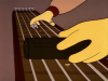
Can any of you eagle eyes tell me what font was used for Speedy's famous front panel?

This is close:

Last edited by Mike McBride on 17 Apr 2024 12:09 pm; edited 1 time in total |
|
|
 |
Brooks Montgomery
From:
Idaho, USA
|
|
|
|
Per Berner
From:
Skovde, Sweden
|
Posted 19 Mar 2024 4:09 am
|
|
The "close" one above is nowhere near, unfortunately. Almost 40 years in advertising tells me it is probably not a specific font at all; more likely a hand drawn design which I guess was made into an inlay. That was the the way they did things back then, all by hand.
If you can get a sharp image straight up, there are ways to search for a match. |
|
|
|
Mike McBride
From:
Indiana
|
Posted 19 Mar 2024 4:36 am
|
|
| Per Berner wrote: |
The "close" one above is nowhere near, unfortunately. Almost 40 years in advertising tells me it is probably not a specific font at all; more likely a hand drawn design which I guess was made into an inlay. That was the the way they did things back then, all by hand.
If you can get a sharp image straight up, there are ways to search for a match. |
Any fonts you can suggest? The one I presented is called Speeday by the way. |
|
|
|
Per Berner
From:
Skovde, Sweden
|
Posted 19 Mar 2024 5:01 am
|
|
| Not without a sharp close-up image. |
|
|
|
Donny Hinson
From:
Glen Burnie, Md. U.S.A.
|
|
|
|
Mike McBride
From:
Indiana
|
Posted 19 Mar 2024 5:19 am
|
|
This is a better view
 |
|
|
|
Per Berner
From:
Skovde, Sweden
|
Posted 19 Mar 2024 5:19 am
|
|
No, no, no. That's like saying Garamond and Times are the same, or Helvetica and Arial. These would require so much tweaking that it is less work starting from scratch.
A visual search using the image yields nothing usable, and from the image you can tell it's hand made, not a font. |
|
|
|
Mike McBride
From:
Indiana
|
Posted 19 Mar 2024 5:24 am
|
|
| Donny Hinson wrote: |
Except for the irregular tails on the letter "S", Vipnagorgialla pretty much nails it.
|
Nice work Donny!
 |
|
|
|
Per Berner
From:
Skovde, Sweden
|
Posted 19 Mar 2024 5:30 am
|
|
Sorry, still nowhere near. Look at the P, the S, the D, the W, the difference in thickness of vertical and horizontal lines. Please believe a typography pro, THIS IS HAND DRAWN, NOT A FONT.
Maybe you can make yourself believe that your Chevy is a Cadillac, but that doesn't make it true – and everyone else will know. |
|
|
|
Mike McBride
From:
Indiana
|
Posted 19 Mar 2024 6:48 am
|
|
| Man I love this group! We've got Idaho, Maryland and Sweden working on this problem! |
|
|
|
Landon George
From:
North Carolina, USA
|
Posted 19 Mar 2024 6:53 am
|
|
Looking forward to seeing how this comes out!
_________________
"Straight ahead and strive for tone" - Ira Bernstein |
|
|
|
Jon Light
From:
Saugerties, NY
|
Posted 19 Mar 2024 7:03 am
|
|
| Certainly, if you see something that pleases you, that gets you in the ballpark of where you want to be, that's all that matters. But I agree with Per 100%. There are some superficial similarities between Speedy's logo and some of the letters of the fonts referenced here (and some that I found in a search). But the differences are large. |
|
|
|
Mike McBride
From:
Indiana
|
Posted 19 Mar 2024 7:14 am
|
|
| Jon Light wrote: |
| Certainly, if you see something that pleases you, that gets you in the ballpark of where you want to be, that's all that matters. But I agree with Per 100%. There are some superficial similarities between Speedy's logo and some of the letters of the fonts referenced here (and some that I found in a search). But the differences are large. |
Yeah this is for a fun hobby project not a profession and is certainly not a dogmatic pursuit of perfection. The original was hand-painted so I am only trying to approximate it. |
|
|
|
Donny Hinson
From:
Glen Burnie, Md. U.S.A.
|
Posted 19 Mar 2024 9:49 am
|
|
| Per Berner wrote: |
| The "close" one above is nowhere near, unfortunately. Almost 40 years in advertising tells me it is probably not a specific font at all; more likely a hand drawn design... |
I agree, Per. The kerning is different, and the differences in the two "S" characters in the original is the indicator of something irregular and hand-drawn.
Still, I'm just trying to help. Can you do better?  |
|
|
|
Mike McBride
From:
Indiana
|
Posted 19 Mar 2024 11:33 am
|
|
Here is a better view. Donny - I agree - Vipnagorgialla pretty much nails it.
 |
|
|
|
David Ellison
From:
California, USA
|
Posted 24 Mar 2024 11:16 am
|
|
| Back in those days, the only "fonts" were professional typesetting used for printed material... ink on paper. This is hand lettering, and most likely done by Paul Bigsby himself. |
|
|
|
John McClung
From:
Olympia WA, USA
|
Posted 24 Mar 2024 3:15 pm
|
|
At least it's not Comic Sans. Horrors!
I also agree with David Ellison's assessment: hand lettered most likely.
_________________
E9 INSTRUCTION
▪️ If you want to have an ongoing discussion, please email me, don't use the Forum messaging which I detest! steelguitarlessons@earthlink.net |
|
|
|
John Larson
From:
Pennsyltucky, USA
|
Posted 24 Mar 2024 3:19 pm
|
|
I know what it reminds me of. Not the same either.

_________________
Rejoice in the Lord, O ye righteous; praise is meet for the upright. Give praise to the Lord with the harp, chant unto Him with the ten-stringed psaltery. Sing unto Him a new song, chant well unto Him with jubilation. For the word of the Lord is true, and all His works are in faithfulness. The Lord loveth mercy and judgement; the earth is full of the mercy of the Lord.
- Psalm 33:1-5 |
|
|
|
Mike McBride
From:
Indiana
|
Posted 17 Apr 2024 12:08 pm Sppedy West Low Dollar Homage
|
|
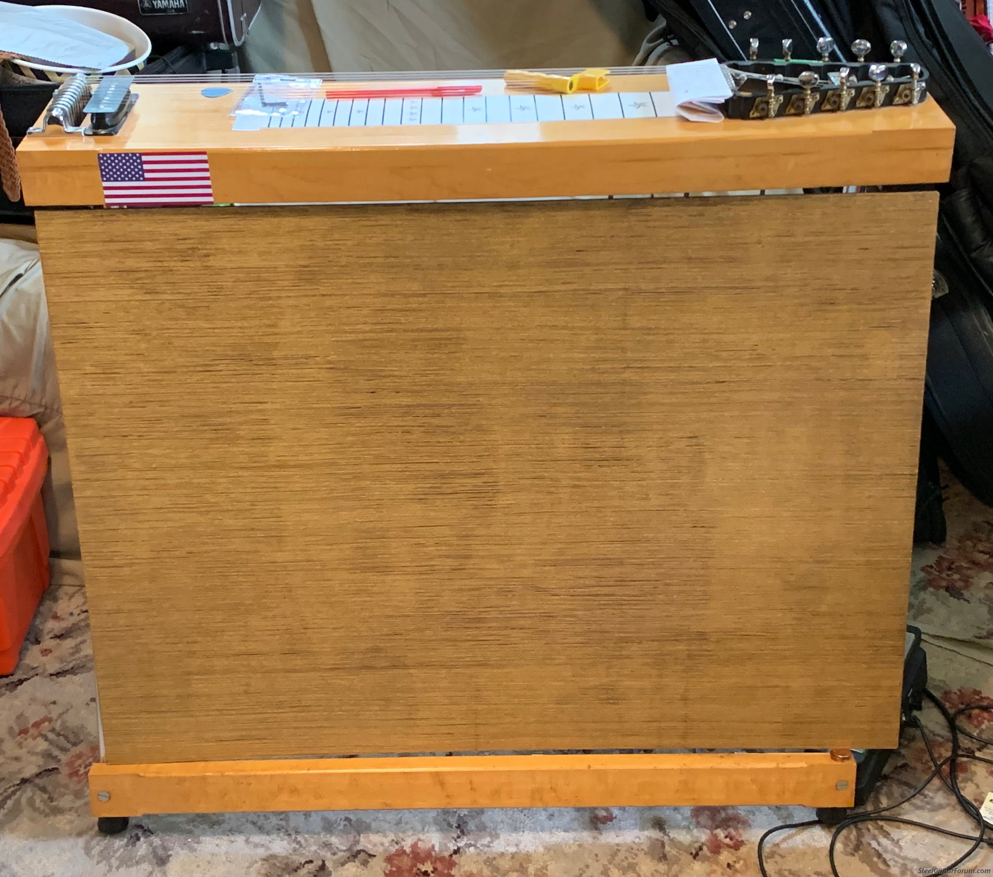
Progress is slowly happening on my low buck Speedy West homage.
Letters are waiting for application.
 |
|
|
|
Mike McBride
From:
Indiana
|
Posted 21 Apr 2024 12:57 pm
|
|
My low buck tribute to a $1,000,000 guitar.
 |
|
|
|